2-6编程问题
来源:2-7 编程练习

dievu
2017-07-16 11:11:43
<!DOCTYPE html>
<html>
<head>
<meta charset="UTF-8">
<title></title>
<style type="text/css">
/*此处写代码*/
*{
margin:0;
padding:0;
}
.header{
width: 100%;
height: 100px;
margin: 0 auto;
background-color: #000;
position: fixed;
}
.logo{
float: left;
}
.nav{
width: auto;
height: 100px;
margin-right: 20px;
float: right;
}
.nav span{
font-size: 16px;
font-family: "微软雅黑";
text-align: center;
line-height: 100px;
color: #fff;
margin-top: -100px;
}
.container{
width: 100%;
height: auto;
background: center top no-repeat;
margin:0 auto;
padding-top: 100px;
padding-bottom: 100px;
}
.container img{
height: 100%;
width: 100%;
}
.footer{
width: 100%;
height:100px;
background-color: #000;
bottom: 0;
position: fixed;
}
.footer .content{
width: 500px;
height: 100px;
position: absolute;
left: 50%;
margin-left: -250px;
}
.footer .content span{
width: auto;
height: 100px;
color: #fff;
font-size: 16px;
font-family: "微软雅黑";
text-align: center;
line-height: 100px;
}
</style>
</head>
<body>
<!-- 此处写代码 -->
<div class="header">
<div class="logo">
<img src="http://climg.mukewang.com/58c0d2d900016ce303000100.png" alt="">
</div>
<div class="nav">
<span>课程 </span><span>职业路径 </span><span>实战 </span><span>猿问 </span><span>手记 </span>
</div>
</div>
<div class="container">
<div class="content"><img src="http://climg.mukewang.com/58c0eda50001e12416000480.jpg" alt=""></div>
<div class="content"><img src="http://climg.mukewang.com/58c0edb80001c9f216000480.jpg" alt=""></div>
<div class="content"><img src="http://climg.mukewang.com/58c0edc9000100d516000480.jpg" alt=""></div>
</div>
<div class="footer">
<div class="content">
<span>网站首页 </span><span>企业合作 </span><span>人才招聘 </span><span>联系我们 </span><span>常见问题 </span><span>网友情链接</span>
</div>
</div>
</body>
</html>
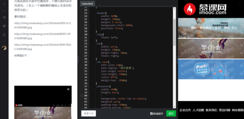
在浏览器中显示全屏和小屏幕都符合要求。 右边全屏是也符合要求。 但是不全屏时就是右边这样的效果了
请老师帮我看一下我这个代码的整体结构怎么样? 问题在哪。。。十分感谢
1回答
-
这个跟响应式有关系,后面的进阶课程里面有讲哦,目前阶段建议设置一个最小的宽度及min-width,让页面缩小到一定程度不在缩小即可
1h017-07-16

相似问题